Google Page Experience
Ultimate Guide to optimize and rank #1
Google is set to launch its new Page Experience algorithm in May 2021.
In this NEW Guide I’ll tell you everything about Google Page Experience like :
- What is it?
- Ranking factors
- How to optimize your website for it
And LOTS MORE.
Without further talks, let’s just explore the topic…
Contents

Intro to the Algorithm Update

Core Web Vitals
Mobile – Friendliness

Website Security
Intrusive Interstitials
Bonus Chapter: AMP
Conclusion
Chapter 1
Intro the Algorithm Update
What is the Google Page Experience Update?
The Page Experience Update is a new algorithm designed to rank pages with a super-good user experience.
This update will directly deal with how searchers interact with a page and their experience with it. Webpages that provide a good user experience are gonna rank higher in the search results.
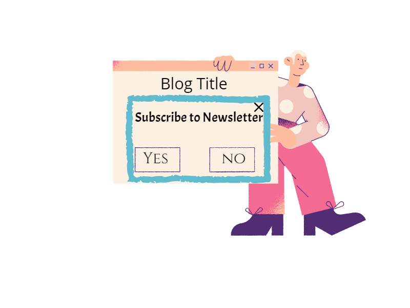
Here’s a GIF from Google explaining Page Experience :
The person wanted to go back but a pop-up shifted the buttons and the order got placed. (Money Wasted!)
This must have been experienced by many of us on webpages where we want to click a button and suddenly there is a shift and an Advertisement gets clicked.
The Page Experience signal shall aim at downranking such pages so that users find their answers quickly on Google.
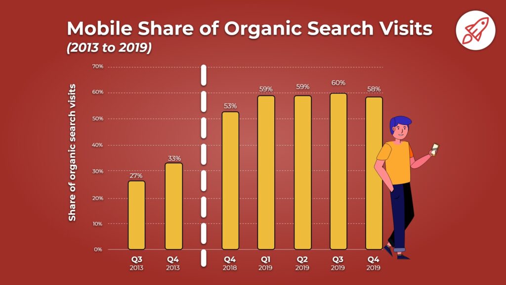
This update shall be aimed more at mobile devices because mobile devices account for over 58% of the internet traffic and that number is growing…
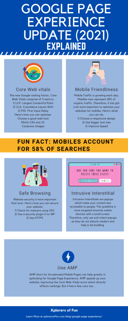
Google Page Experience Ranking Factors
This algorithm shall measure rankings on the following basis :
- Core Web Vitals (More on that): A bunch of factors for which every webpage must be optimized. AMP can also become important.
- Mobile Friendliness (More on that): How “friendly” that page is on mobiles
- Secure Browsing (More on that): Security of webpages
- Intrusive Interstitials (More on that too!): Disturbing pop-ups and lead magnets.
Here’s an infographic showing this:
Now, I’ll discuss each of these factors in super detail and tell you how you can optimize and rank for them. Let’s move on to Chapter 2, Core Web Vitals…
Chapter 2
Core Web Vitals
Core Web Vitals
Core web vitals, as the name suggests are some vital things that must be present on every webpage.
3 factors form CWV (Core Web Vitals). These are :
1) Largest Contentful Paint (LCP): Loading Performance
2) First Input Delay or Total Blocking Time: Interactivity
3) Cumulative Layout Shift (CLS): Visual Stability
Largest Contentful Paint (LCP)
The largest contentful paint metric measures how quickly a page loads. It measures how quickly the main content or the largest image or text on the webpage loads. Google officially recommends keeping the LCP under 2.5 seconds for the best experience.
Here are Google’s words on the topic :
To provide a good user experience, sites should strive to have the Largest Contentful Paint occur within the first 2.5 seconds of the page starting to load. To ensure you’re hitting this target for most of your users, a good threshold to measure is the 75th percentile of page loads, segmented across mobile and desktop devices.
Here is a visual showing a good LCP :
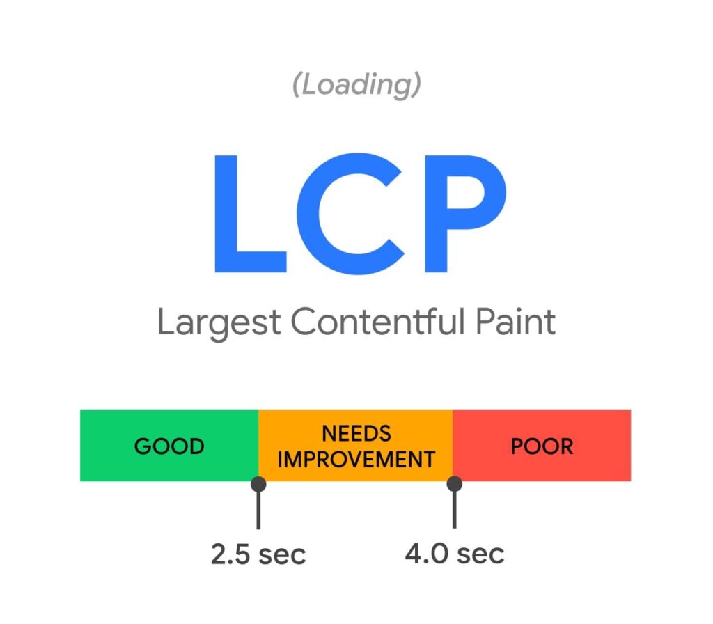
Anything under 2.5 secs is good, till 4.0 seconds in OK and above that is BAD…
If you still haven’t understood, then here’s a visual showing the LCP of popular sites :
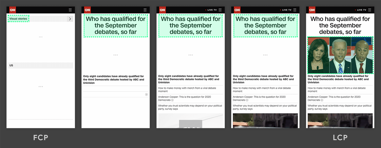
In the above graphic, the LCP was the image. There was a white screen until it loaded.
Summing up, here’s the definition of LCP :
“The LCP is the time till the largest visible content on the page loads.”
How to measure LCP
LCP can be measured very easily with these tools :
1) GTMetrix
Just pop in your URL in GTMetrix and you’ll get a report showing all your web vitals. Here’s how mine looked :
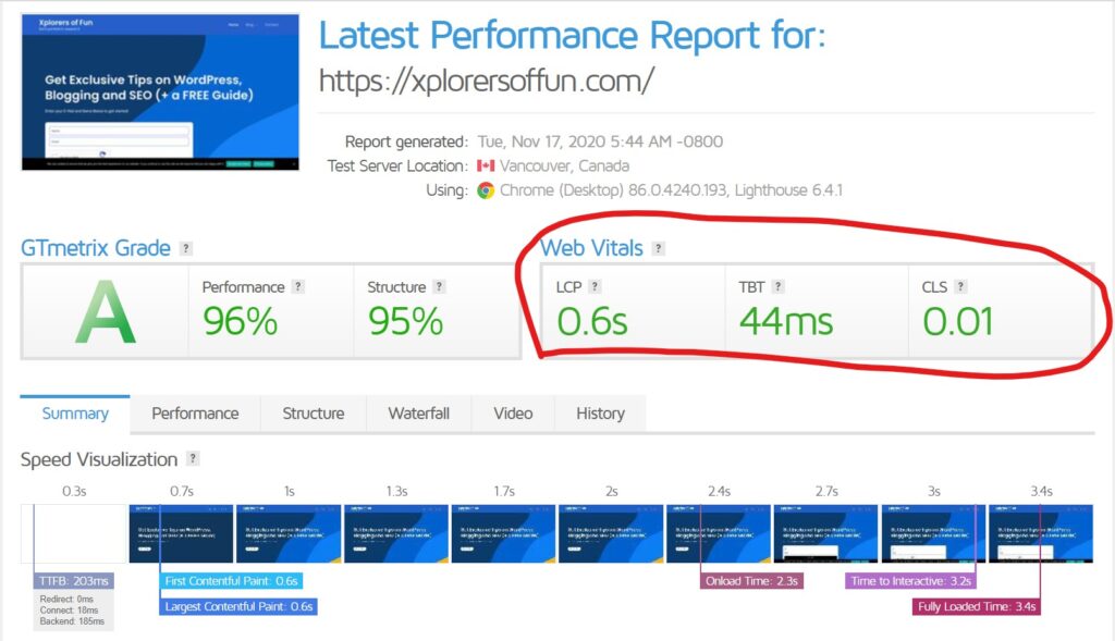
This website stood upon the results and had an LCP lower than 2.5 secs…
2) Page Speed Insights
PageSpeed Insights Tool by Google is an amazing speed testing tool. It shall show you all your metrics like FCP, LCP, CLS, TBT, etc…
3) Google Search Console
Google Search Console is an amazing tool for measuring your website search ranking and SEO. Just head over to the Core Web Vitals Report in your GSC and improve all your URL’s which it shows. Here’s how it looks :
How to optimize your LCP
You can optimize your LCP by the following methods :
1) Choose a good server
This mostly depends on your web hosting. Some of the best web hosts with a fast server are :
- Kinsta (Developed by makers of WordPress)
- Hostinger (Over 90% OFF)
- Namecheap (Over 99% OFF)
- Green Geeks (Over 75% OFF)
- Bluehost (Recommended by WordPress)
If you click my link above and buy web hosting, only then will you get discounts on web hosts otherwise you’ll have to pay the normal price. Don’t forget to bookmark this page so that you can come back later and get HUGE Discounts on web hosts…
2) Eliminate render-blocking resources
Render blocking resources play a major role in your website speed. You’ll have to eliminate them if you want to increase site speed.
I created a tutorial on eliminating render-blocking resources which you can check out by clicking here.
If you prefer visual instructions, then watch this video :
3) Use a CDN (Content Delivery Network)
Content delivery networks play a major role in website speed. Using a CDN can make your website 2-3 times faster.
Content Delivery Networks help serve content quickly to users that are far away from your server.
Eg: If your website has its server in the USA and a person from New Zealand visits your website, it’s going to take time for the site to load, but if you use a CDN, the website will load much faster…
Here are some of the best CDN’s :
Also, some web hosts like Kinsta provide their blazing-fast CDN, which you’ll only get if you purchase web hosting from them.
4) Caching
Caching can help your website load faster by storing a copy of your website in the browser and serving it to visitors.
Some of the best FREE WordPress caching plugins are :
5) Minify CSS and JS
Minification plays a major role when it comes to speed optimization. It is the process of removing unnecessary things from scripts and stylesheets to make their size smaller.
Minification can be done easily with plugins if you use a CMS like WordPress, Drupal, Joomla, etc…
Otherwise, you’ll have to check with your website builder if they use minification by default or not…
6) Optimize your images
Image Optimization is very necessary for faster LCP. It becomes even more important if you have a webpage like this :
Webpages with a large featured image or hero images must follow image optimization more intensively. Here’s what you can do for optimizing your images :
1) Choose a good image type
You must use JPG, WebP, JPEG 200, etc. formats for images to keep size low.
2) Compress Images
If you are on WordPress, download the Smush plugin to optimize your images for the best performance.
Here’s how to set it up after download…
If you are using some other platform, then use an external online compression service.
3) Serve scaled images
Serving images with correct dimensions can help a lot for image speed. If you have the Smush plugin for WordPress, you are in good luck!
It automatically tells you wrongly sized images and helps you correct their sizes.
If you want to server scaled images, read this tutorial…
4) Use an image CDN
Using an Image CDN can help you decrease load times. The CDN’s I told you above also help serve images. If you did not read that section, here are the CDN’s :
5) Use Lazy Loading
Lazy Loading is the best image optimization practice. This technology loads images only when they become visible to the user. This helps speed up page loading because all the images are not loaded at once. The Smush Plugin helps you achieve this too.
It is the best image optimization plugin and it is used at 1 Million + websites…
First Input Delay (FID)
The First Input Delay (FID), is the second metric in the Web Vitals. It measures the interactivity of the page.
Here’s the meaning in Simple English :
Suppose, you visit a website, example.com… The website loads and you click a button but nothing happens. After a second or so, you again click the button and it works.
Now, the time between the page load and the working of the button is called First Input Delay.
If the button responds in 500 ms, then the FID will be 500 ms.
Here’s a visual defining optimal FID :
Anything below 100 ms is amazing, till 300 ms is OK and above 300 ms is poor…
How to analyze FID
FID can be analyzed with GTMetrix and Google Page Speed Insights. Just pop-in your URL and check the results.
I tried with GTMetrix and here’s what my report looked like :
The TBT section means First Input Delay in the report.
How to optimize your FID
Here are some proven steps to optimize your FID :
1) Defer JavaScript
Deferring JavaScript can help in FID improvement. If you are on WordPress, simply download the Async JavaScript Plugin and then configure it like this:
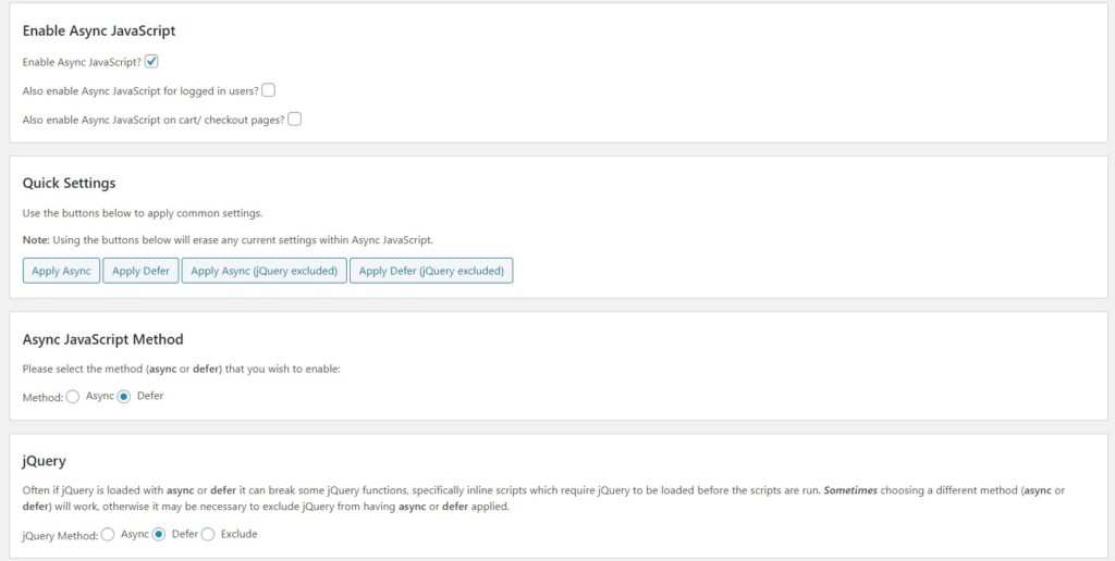
- Enable Async JavaScript
- Apply Defer: Here you’ll have to experiment. You’ll have to try between Defer and Defer ( jQuery Excluded). This is because deferring jQuery can break your site in some cases. If nothing happens, go ahead…
- Async Method: Defer
- jQuery: Optional: Defer or Excluded
I haven’t listed any other steps in this article because all others are very technical steps and would require the hiring of a web developer…
But, if you still need those steps, just click here.
Cumulative Layout Shift (CLS)
Cumulative Layout Shift or CLS is the third and final Core Web Vital. It measures the visual stability of content.
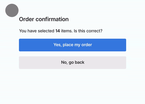
Remember the GIF I showed you in the starting?
If not, click here to go back to it…
In that, the page suddenly shifted down due to which, the buttons shifted and a wrong order was put.
This is very common in today’s webpages. Lots of advertisements or bad images contribute to this.
Here’s a visual showing optimal CLS:
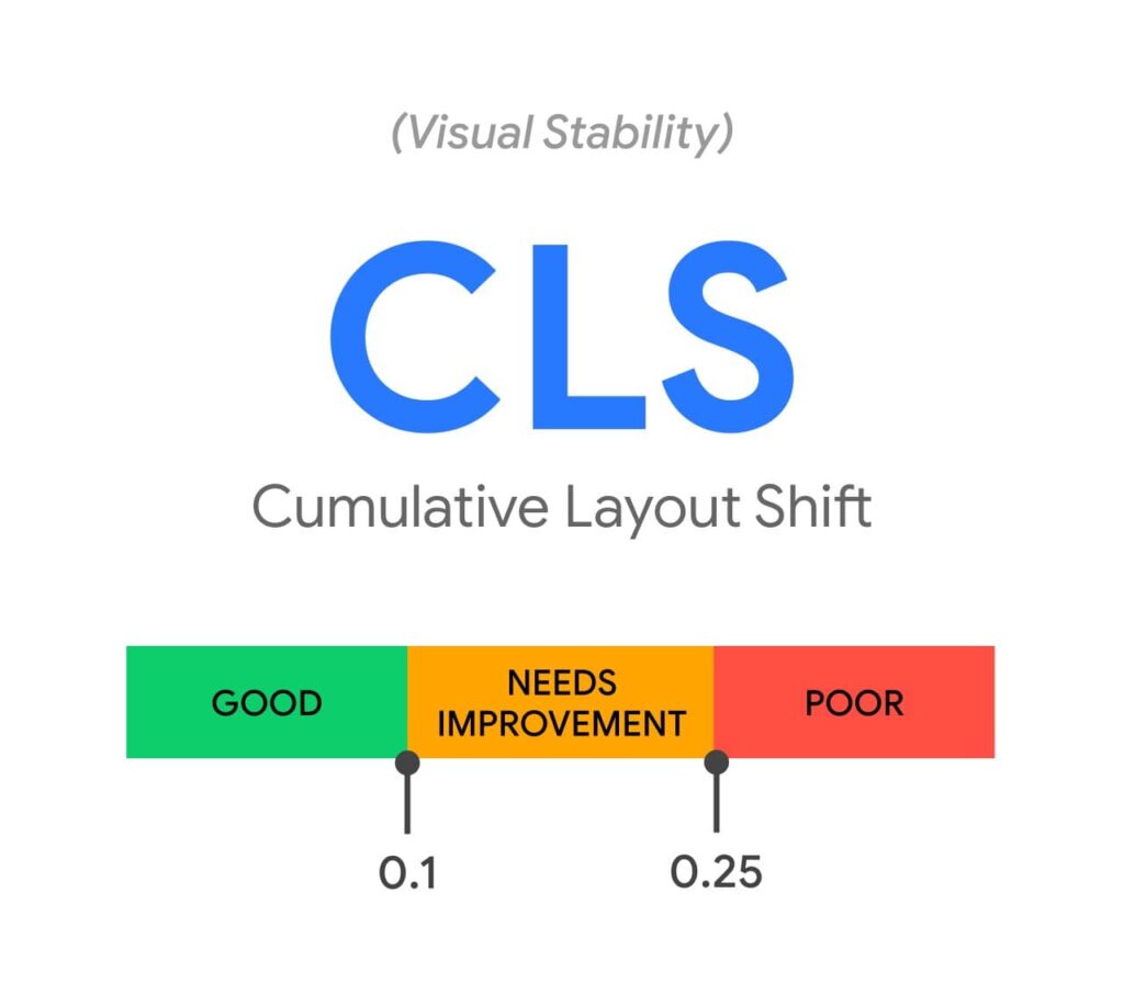
Below 0.1 is what you must target for the best experience.
How to measure CLS
CLS can be measured by using Google PageSpeed Insights or GTMetrix. Just pop in your URL and you’ll see a report containing all your data.
How to optimize CLS?
CLS can be optimized using the below tips :
1) Specify your image dimensions
This is not a very big problem. Most of the website builders help you specify image dimensions while writing or editing. The major problem is the second one which is…
2) Managing your Intrusive Ads
This is a BIG problem. Ads are third-party code so you have very less or NO control over them. Ads are the main contributors to bad CLS. It must have experienced by all of us when we click a button but an AD suddenly loads and we click it…
That is why Ads are not preferred on websites now because they ruin user experience but still a HUGE number of websites (including authority ones) use Ads because they are their major revenue generator…
Instead, you can use something like Affiliate Marketing which generates money without ruining the experience…
If you use Ads, then use only high-quality AD programs like :
- Google Adsense
- Ezoic
- Media.net
You can test your website by removing Ads and checking the difference it makes…
Finally, I have covered literally everything about the Core Web Vitals…
Let us now move on to Chapter 3: Mobile Friendliness…
Chapter 3
Mobile Friendliness
What is mobile-first indexing?
Mobile-first indexing means that Google will only look at the mobile version of your site to determine if it will rank you or not. A website with a bad mobile version will drop in rankings like a rock. Therefore, it’s better to keep your website good on mobile devices if you want to really rank on Google…
Thanks to modern-day website builders and CMS, this is not a big issue… If you use a website builder like WordPress, Zyro, Wix, etc, then chances are that your site is already mobile-friendly.
With that, Here’s the exact process to make your website mobile-friendly :
- Choose a responsive theme on any platform: Responsive themes automatically adjust to the size of the visitor’s device. In other words, they look good on all devices. If you use a reputable website builder, then your platform shall already feature responsive design themes. If you are on WordPress, these are the best themes :
1) Divi
2) Astra
3) Zakra
4) Kadence
These themes will help you build a beautiful looking site within a few minutes. Plus, they all are fully SEO Optimized and RESPONSIVE.
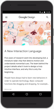
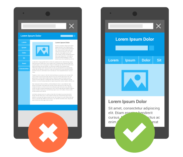
Here’s what a mobile-friendly site looks like:
- Increase your website speed
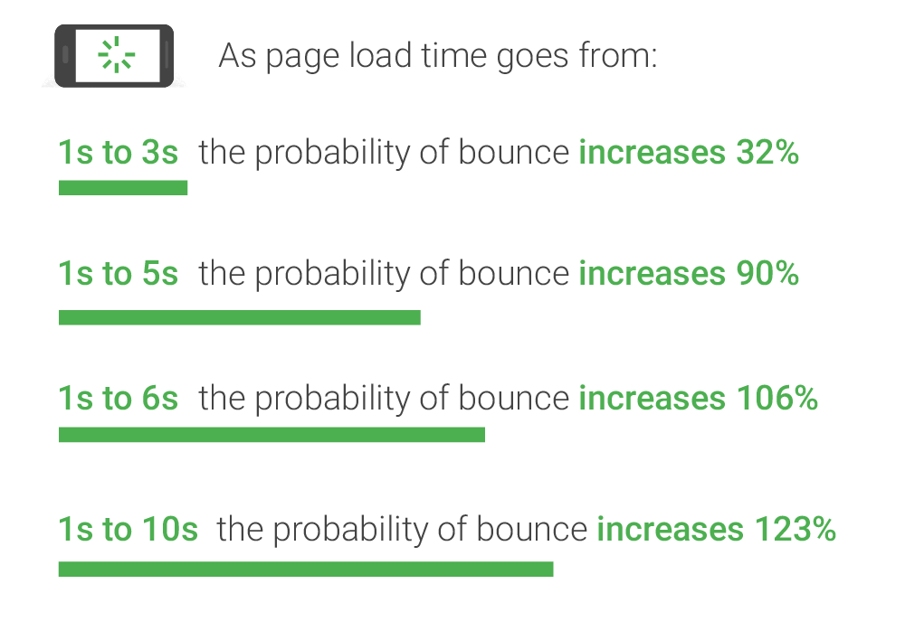
Website speed is very important for being mobile-friendly. Now, 58% of traffic comes from mobiles. For E-Commerce websites, loading speed becomes all the more important.
Customers won’t buy from your shop if your online shop loads slowly. Not only will this lead to loss of revenue but it will also leave a bad impression on users. Here’s a visual from Google showing the importance of speed:
Some steps to improve load speed are :
1) Have a faster FCP
2) Minify CSS and JS
3) Reduce HTTP Requests
- Use high-quality and supported videos and images
You must make sure that you use high-quality images that are easy to understand and also use supported video embeds.
In the process of choosing high-quality images, you must also make sure that your webpage doesn’t load slowly with the help of image compression.
- Use a big text size
You must always use 18px to 20px font for your website so that it is easily readable by people.
- Larger and better clickable elements
Make sure that you have a larger clickable area.
What does that mean?
Let me explain this to you with an example :
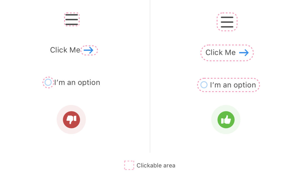
On the left side, you can only click the small arrow and the small circle, but on the right side, you can click the text along with the arrow and button.
This makes a larger clickable area which is necessary for browsing on mobile phones these days.
How to detect issues with your mobile site?
You can detect mobile usability issues on your website using the Google Search Console.
The Google Search Console is a free tool by Google to measure how your website performs in Google Search.
Click here to set up your site with Google Search Console
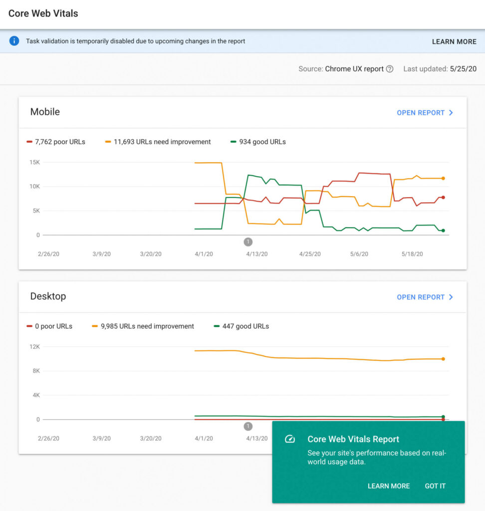
Once you are in your GSC dashboard, just head over to Mobile usability from the sidebar. You’ll see this report :
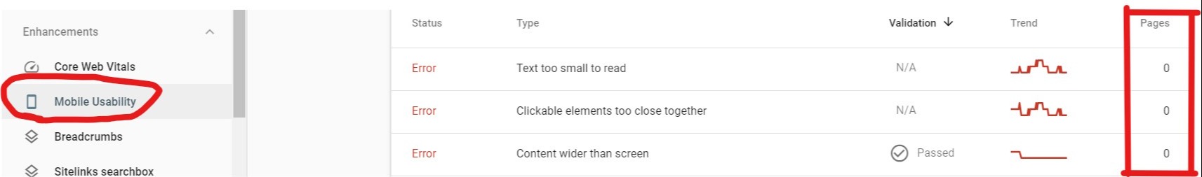
This report shall show you the errors on your site and the URL’s which are affected. In the second column, you can see the trend. This is a line chart showing the number of issues over time. On the side, you can see the number of pages affected.
This particular site had some issues but they have been fixed. Google shall also alert you by E-Mail whenever it detects an issue on your site.
How to check if your website is mobile-friendly or not?
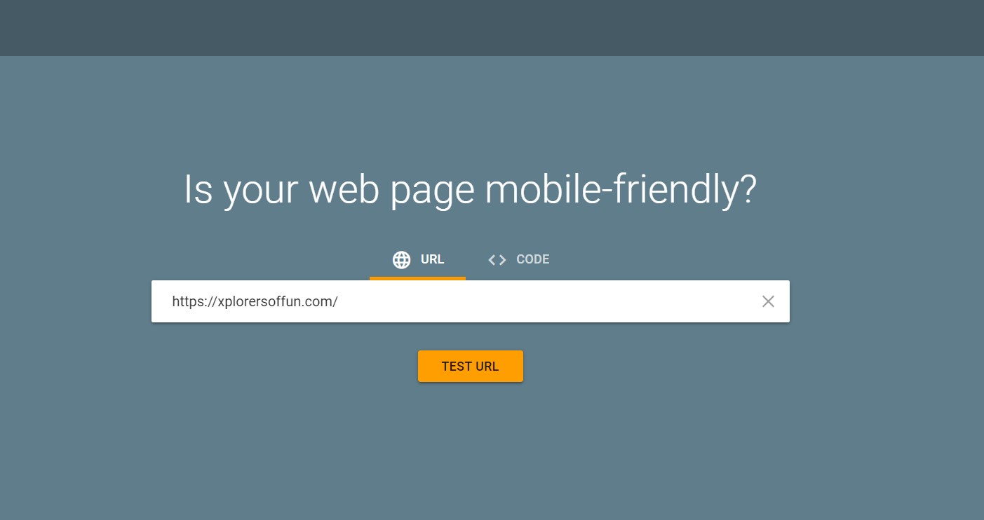
You can check whether your website is already mobile-friendly or not by using the mobile-friendly test from Google.
Just head over to this website and pop in your URL.
Next, wait for the results until you see something like this :
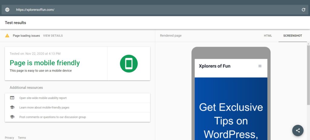
Xplorers of Fun (this site) is mobile friendly as shown by Google. There are a few loading issues, but I’ll fix that!
If you want to take this to the next level, then you can even test with Bing’s mobile-friendly test…
Chapter 4
Website Security
Your website’s security is more important than ever now. You must make sure that you follow these guidelines for better search rankings :
#1: Use HTTPS
HTTPS stands for Hypertext Transfer Protocol Secure. In its basic sense, it means the security of data that is transferred from the user computer to the site.
If you use HTTPS, you’ll see a padlock like this on your site :

This gives visitors a sense of security and they browse without worries on a site.
Most of the website hosts give a free SSL certificate which enables HTTPS on your site. Some of them are :
Also, make sure that all your URLs redirect to the HTTPS version of your site. You’ll have to enable this with your own host.
#2: Stopping Malware Infections and Hacking
You must not let malware and hacking affect your site. To see if your site is hacked, go to Google Search Console. There head over to the security issues report.
If you see something like this :
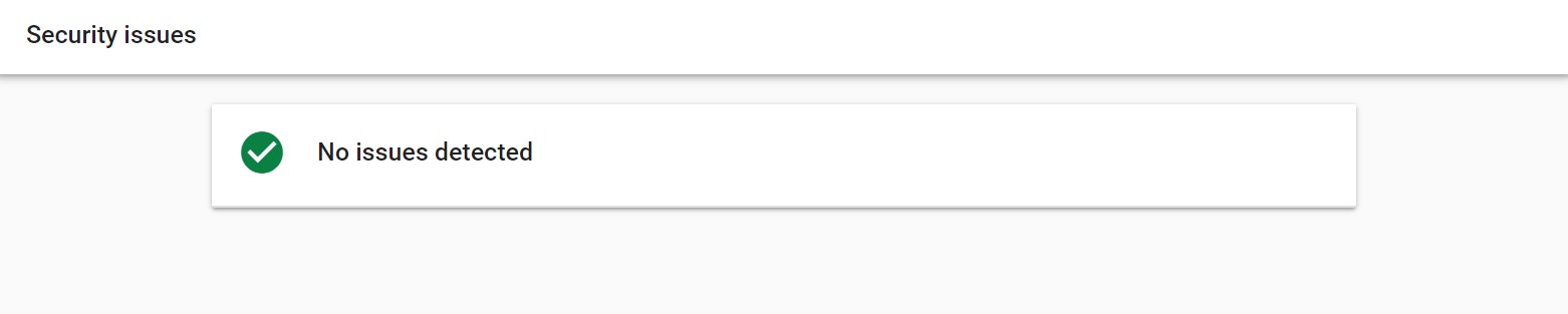
…then all good. Otherwise, Google Search Console will give you instructions to fix the problem.
If you run a multi-author blog then make sure to limit control to other authors.
Make sure to use strong passwords for your site and note them down in 10 to 20 places so that you don’t lose them.
Also, use a CDN for better security and performance both.
#3: Use a security plugin if your run on WordPress
Make sure that you use a security plugin on your WordPress website. The two best are:
These plugins keep a check on your files and tell if they have been edited. They also alert about who logged in to your site.
#4: Make sure to have backups of your site
Taking a backup of your site is very necessary. These will enable you to restore your site if anything goes wrong. Most of the website builders have a backup feature. Some even have a content history feature.
If you are on WordPress, then the best WordPress backup plugins are:
A lot of security issues also depend upon your web host. Therefore, choose a web host with great care.
Let us now move on to our last chapter: Popups
Chapter 5
Intrusive Interstitials (Popups)
Popups are a two-sided sword. They obviously help in list building but they also ruin the experience if used in the wrong way. In this chapter, I’ll show you how to use them in the right way keeping page experience in mind…
Google’s guidelines about Popups
According to Google, a pop-up will be classified as an intrusive interstitial if it makes the content less accessible.
Here’s what it means:
The popups which:
- Show up when you land
- Cover the whole screen
- Above the fold content which looks like popups
The above are classified as intrusive interstitials.
Intrusive popups basically make content less accessible to users which Google HATES. This especially applies to mobile popups.
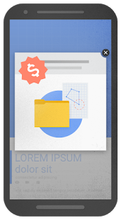
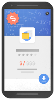
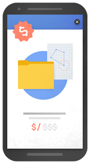
In the right you can see examples of intrusive popups:
In the basic sense, a popup that makes the content less accessible is defined as an intrusive interstitial.
Although you can use popups for cookies or age verification without any issues.
But how do you use popups without hurting your SEO?
This is what I’ll tell next but before that, we must understand the different types of popups.
Different types of popups
Based on the display, I’ll tell you 3 types of popups. These are:
- Exit Intent: Show when a user is about to leave
- “Time on page”: Show after a specified time for which the user has been on the page
- On landing: Just when a user arrives.
How to use popups without making Google angry?
There are three ways to use popups without hurting your rankings. They are:
1) Use Exit-Intent: Exit Intent popups are the BEST. They show up when the user is about to leave, so that doesn’t cause inconvenience to anyone.
2) Use Time on Page: If your popup maker doesn’t support exit intent, then you can use time-on-page. Just check your article’s reading time and then at the exact point, show the popup. If your article’s reading time is 6 mins then show the popup when 4 minutes pass by.
3) Use after-post subscription forms: This is not basically a popup. It’s a form placed at the end of each post for list building. If you do not want to use popups then this can be a good option.
Your website might be supporting popups which you can check with them but if you want FREE popup makers for WordPress then read my guide on the Best FREE Popup Making Plugins for WordPress.
Let me now give you the bonus tip to optimize for the page experience algorithm update…
BONUS CHAPTER
AMP (Accelerated Mobile Pages)
AMP stands for Accelerated Mobile Pages. It helps you optimize even more for the Google Page Experience Signal.
As I told you in the starting, Core Web Vitals are now a key ranking factor, and using AMP helps you master that metric.
Pages with AMP load faster because all their fancy CSS is stripped down but that also leads to a not-so-good-looking page…
There are certain pros and cons of AMP. In short, here they are:
Pros
- Faster loading time
- Less load on the server
- Better rankings
Cons
- No fancy designs
- No social shares and email collection
- Link Building can go vain…
Conclusion
The new page experience ranking signal will definitely affect websites but Google has said, “Content is still the king”. If you have a bad user experience but mindblowing and relevant content then your visibility in search won’t be affected. After all quality content is what Google wants…
Also, Google has given us six months’ notice before the update due to the pandemic.
Phew! This MASSIVE guide took a lot of effort.
Now I would like to hear from you.
Will you use AMP on your site?
Or are you going to change your web host for faster performance?
Either way, let me know in the COMMENTS BELOW!
Don’t forget to share this post and spread the word out!